# Import all required libraries
# Data analysis and manipulation
import pandas as pd
# Working with arrays
import numpy as np
# Statistical visualization
import seaborn as sns
# Matlab plotting for Python
import matplotlib.pyplot as plt
# Data analysis
import statistics as stat
# Predictive data analysis: process data
from sklearn import preprocessing as pproc
import scipy.stats as stats
# Visualizing missing values
import missingno as msno
# Interactive HTML EDA report
from ydata_profiling import ProfileReport

# Increase font size of all Seaborn plot elements
sns.set(font_scale = 1.25)Diagnosing like a Data Doctor
Purpose of this chapter
Exploring a novel data set and produce an HTML interactive reports
Take-aways
- Load and explore a data set with publication quality tables
- Diagnose outliers and missing values in a data set
- Prepare an HTML summary report showcasing properties of a data set
Required Setup
We first need to prepare our environment with the necessary libraries and set a global theme for publishable plots in seaborn.
Load and Examine a Data Set
- Load data and view
- Examine columns and data types
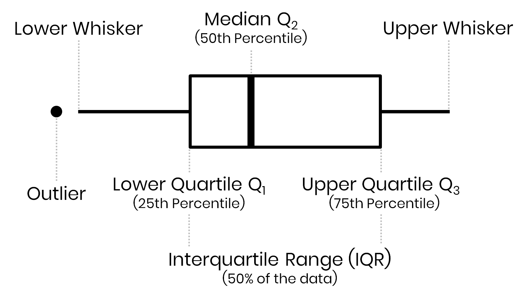
- Define box plots
- Describe meta data
We will be using open source data from UArizona researchers for Test, Trace, Treat (T3) efforts offers two clinical diagnostic tests (Antigen, RT-PCR) to determine whether an individual is currently infected with the COVID-19 virus. (Merchant et al. 2022)
# Read csv
data = pd.read_csv("data/daily_summary.csv")

# Convert 'result_date' column to datetime
data['result_date'] = pd.to_datetime(data['result_date'])

# What does the data look like
data.head()
result_date affil_category ... test_count test_source
0 2020-08-04 Employee ... 5 Campus Health
1 2020-08-04 Employee ... 0 Campus Health
2 2020-08-04 Employee ... 1 Test All Test Smart
3 2020-08-04 Employee ... 0 Test All Test Smart
4 2020-08-04 Off-Campus Student ... 9 Campus Health
[5 rows x 6 columns]Diagnose your Data
# What are the properties of the data
diagnose = data.info()
<class 'pandas.core.frame.DataFrame'>
RangeIndex: 9180 entries, 0 to 9179
Data columns (total 6 columns):
# Column Non-Null Count Dtype
--- ------ -------------- -----
0 result_date 9180 non-null datetime64[ns]
1 affil_category 9180 non-null object
2 test_type 9180 non-null object
3 test_result 9180 non-null object
4 test_count 9180 non-null int64
5 test_source 9180 non-null object
dtypes: datetime64[ns](1), int64(1), object(4)
memory usage: 430.4+ KBColumn: name of each variableNon-Null Count: number of missing valuesDType: data type of each variable
Summary Statistics of your Data
Numerical Variables
# Summary statistics of our numerical columns
data.describe()
result_date test_count
count 9180 9180.000000
mean 2021-06-23 02:28:32.941176576 46.771024
min 2020-08-04 00:00:00 0.000000
25% 2021-01-11 00:00:00 0.000000
50% 2021-06-09 00:00:00 2.000000
75% 2021-12-01 00:00:00 16.000000
max 2022-06-30 00:00:00 1472.000000
std NaN 129.475844count: number of observationsmean: arithmetic mean (average value)std: standard deviationmin: minimum value25%: 1/4 quartile, 25th percentile50%: median, 50th percentile75%: 3/4 quartile, 75th percentilemax: maximum value
Outliers
Values outside of \(1.5 * IQR\)
There are several numerical variables that have outliers above, let’s see what the data look like with and without them
Create a table with columns containing outliers
Plot outliers in a box plot and histogram
# Make a copy of the data
dataCopy = data.copy()

# Select only numerical columns
dataRed = dataCopy.select_dtypes(include = np.number)

# List of numerical columns
dataRedColsList = dataRed.columns[...]

# For all values in the numerical column list from above
for i_col in dataRedColsList:
  # List of the values in i_col
  dataRed_i = dataRed.loc[:,i_col]

  # Define the 25th and 75th percentiles
  q25, q75 = round((dataRed_i.quantile(q=0.25)), 3), round((dataRed_i.quantile(q=0.75)), 3)

  # Define the interquartile range from the 25th and 75th percentiles defined above
  IQR = round((q75 - q25), 3)

  # Calculate the outlier cutoff
  cut_off = IQR * 1.5

  # Define lower and upper cut-offs
  lower, upper = round((q25 - cut_off), 3), round((q75 + cut_off), 3)

  # Print the values
  print(' ')

  # For each value of i_col, print the 25th and 75th percentiles and IQR
  print(i_col, 'q25=', q25, 'q75=', q75, 'IQR=', IQR)

  # Print the lower and upper cut-offs
  print('lower, upper:', lower, upper)

  # Count the number of outliers outside the (lower, upper) limits, print that value
  print('Number of Outliers: ', dataRed_i[(dataRed_i < lower) | (dataRed_i > upper)].count())
test_count q25= 0.0 q75= 16.0 IQR= 16.0
lower, upper: -24.0 40.0
Number of Outliers: 1721q25: 1/4 quartile, 25th percentileq75: 3/4 quartile, 75th percentileIQR: interquartile range (q75-q25)lower: lower limit of \(1.5*IQR\) used to calculate outliersupper: upper limit of \(1.5*IQR\) used to calculate outliers
# Change theme to "white"
sns.set_style("white")

# Select only numerical columns
dataRedColsList = data.select_dtypes(include = np.number)

# Melt data from wide-to-long format
data_melted = pd.melt(dataRedColsList)

# Boxplot of all numerical variables
sns.boxplot(data = data_melted, x = 'variable', y = 'value', hue = 'variable' , width = 0.20)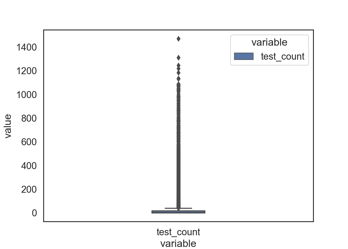
Note the extreme number of outliers represented in the boxplot
# Find Q1, Q3, and interquartile range (IQR) for each column
Q1 = dataRedColsList.quantile(q = .25)
Q3 = dataRedColsList.quantile(q = .75)
IQR = dataRedColsList.apply(stats.iqr)

# Only keep rows in dataframe that have values within 1.5*IQR of Q1 and Q3
data_clean = dataRedColsList[~((dataRedColsList < (Q1 - 1.5 * IQR)) | (dataRedColsList > (Q3 + 1.5 * IQR))).any(axis = 1)]

# Melt data from wide-to-long format
data_clean_melted =  pd.melt(data_clean)

# Boxplot of all numerical variables, with outliers removed via the IQR cutoff criteria
sns.boxplot(data = data_clean_melted, x = 'variable', y = 'value', hue = 'variable' , width = 0.20)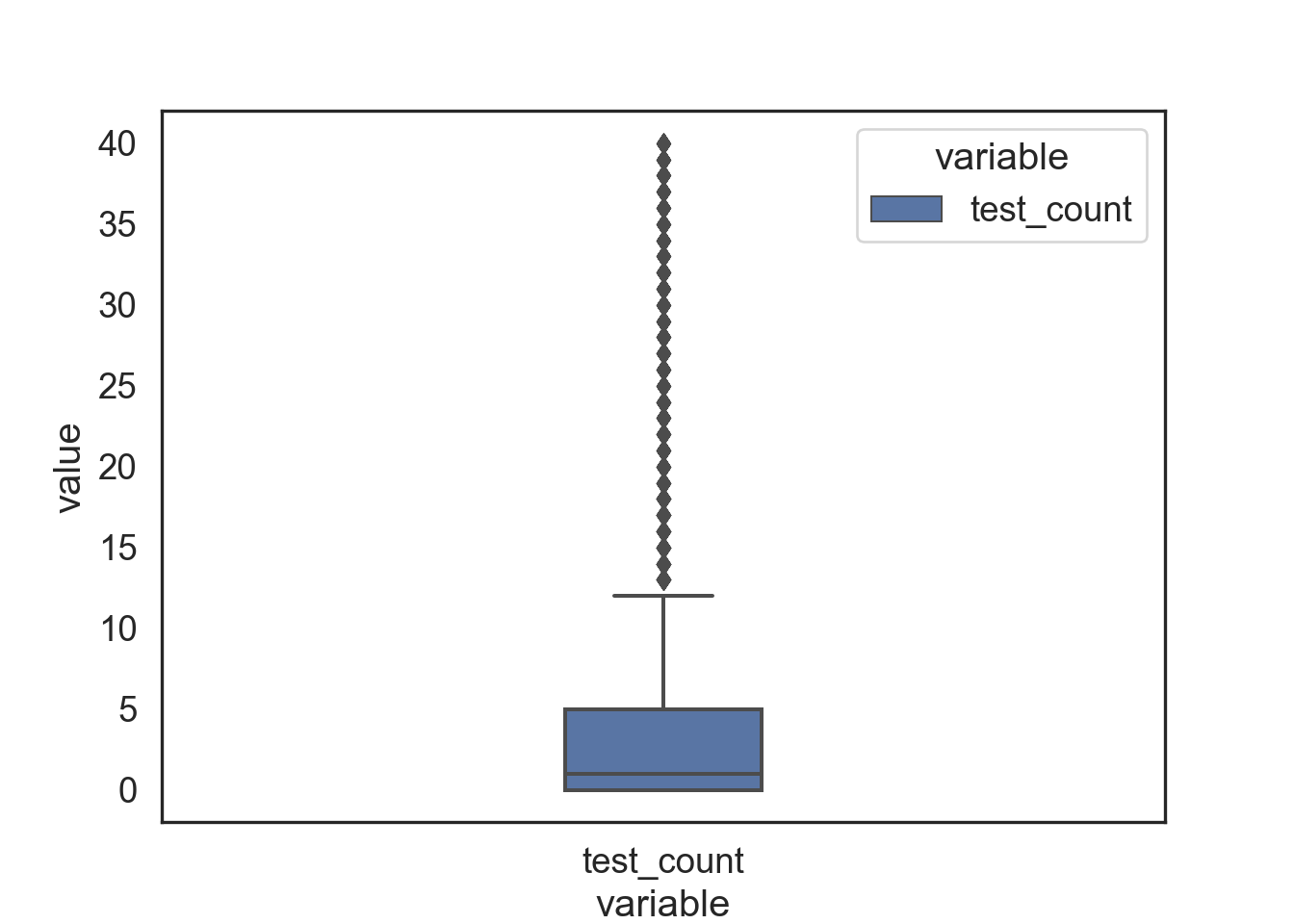
But the distribution changes dramatically when we remove outliers with the IQR method (see above). Interestingly, there are a new set of “outliers” which results from a new IQR being calculated.
Missing Values (NAs)
- Table showing the extent of NAs in columns containing them
# Copy of the data
dataNA = data

# Randomly add NAs to all columns replacing 10% of values
for col in dataNA.columns:
    dataNA.loc[dataNA.sample(frac = 0.1).index, col] = np.nan

# Sum of NAs in each column (should be the same, 10% of all)
dataNA.isnull().sum()
result_date 918
affil_category 918
test_type 918
test_result 918
test_count 918
test_source 918
dtype: int64Bar plot showing all NA values in each column. Since we randomly produced a set amount above the numbers will all be the same.
# Bar plot showing the number of NAs in each column
msno.bar(dataNA, figsize = (8, 8), fontsize = 10)
plt.tight_layout()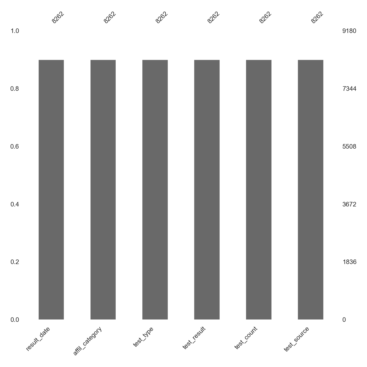
Categorical Variables
# Select only categorical columns (objects) and describe
data.describe(exclude = [np.number])
result_date ... test_source
count 8262 ... 8262
unique NaN ... 2
top NaN ... Test All Test Smart
freq NaN ... 4555
mean 2021-06-22 02:30:56.209150720 ... NaN
min 2020-08-04 00:00:00 ... NaN
25% 2021-01-09 06:00:00 ... NaN
50% 2021-06-09 00:00:00 ... NaN
75% 2021-11-30 00:00:00 ... NaN
max 2022-06-30 00:00:00 ... NaN
[10 rows x 5 columns]count: number of values in the columnunique: the number of unique categoriestop: category with the most observationsfreq: number of observations in the top category
Produce an HTML Summary of a Data Set
# Producing a pandas-profiling report
profile = ProfileReport(data, title = "Pandas Profiling Report")

# HTML output
profile.to_widgets()
Merchant, Nirav C, Jim Davis, George H Franks, Chun Ly, Fernando Rios, Todd Wickizer, Gary D Windham, and Michelle Yung. 2022. “University of Arizona Test-Trace-Treat COVID-19 Testing Results.” University of Arizona Research Data Repository. https://doi.org/10.25422/AZU.DATA.14869740.V3.